BuildingLink Admin Portal
Redesign of an outdated admin portal into a modern, intuitive platform—boosting user engagement, cutting support hours, and driving recurring revenue

About BuildingLink
BuildingLink helps property managers, developers, and condominium boards across the globe deliver a superior resident experience while streamlining maintenance and operations.
Goal
As a key member of the 4-person BuildingLink design team, I was integral in redesigning this legacy property management software (used by millions) with a fresh, modern interface that attracts new users while remaining intuitive for existing ones. The goal was to declutter and revitalize the design, enhancing usability, streamlining workflows, and saving valuable time for landlords, management companies, and tenants.
My role
Strategy & research
User research uncovered daily task pain points, so I streamlined the app layout for better efficiency and navigation.
Ideation & wireframing
I donned the hats of every resident type, sketching their frustrations and joys to spark user-centric solutions.
Systematic prototyping
Leveraging a robust design system and extensive prototyping process, I crafted an iteratively refined product while seamlessly collaborating with product managers and engineers.
QA & GTM
Through a streamlined review and extensive QA framework, I eliminated errors and optimized performance, delivering a final product that runs like clockwork.

-
“I absolutely love the new UI/UX updates. Everything feels so much more intuitive and user-friendly. The modern design makes navigating the system a breeze. Managing tasks and accessing information is now faster and more efficient than ever!”
Property manager in NYC
Problems & solutions
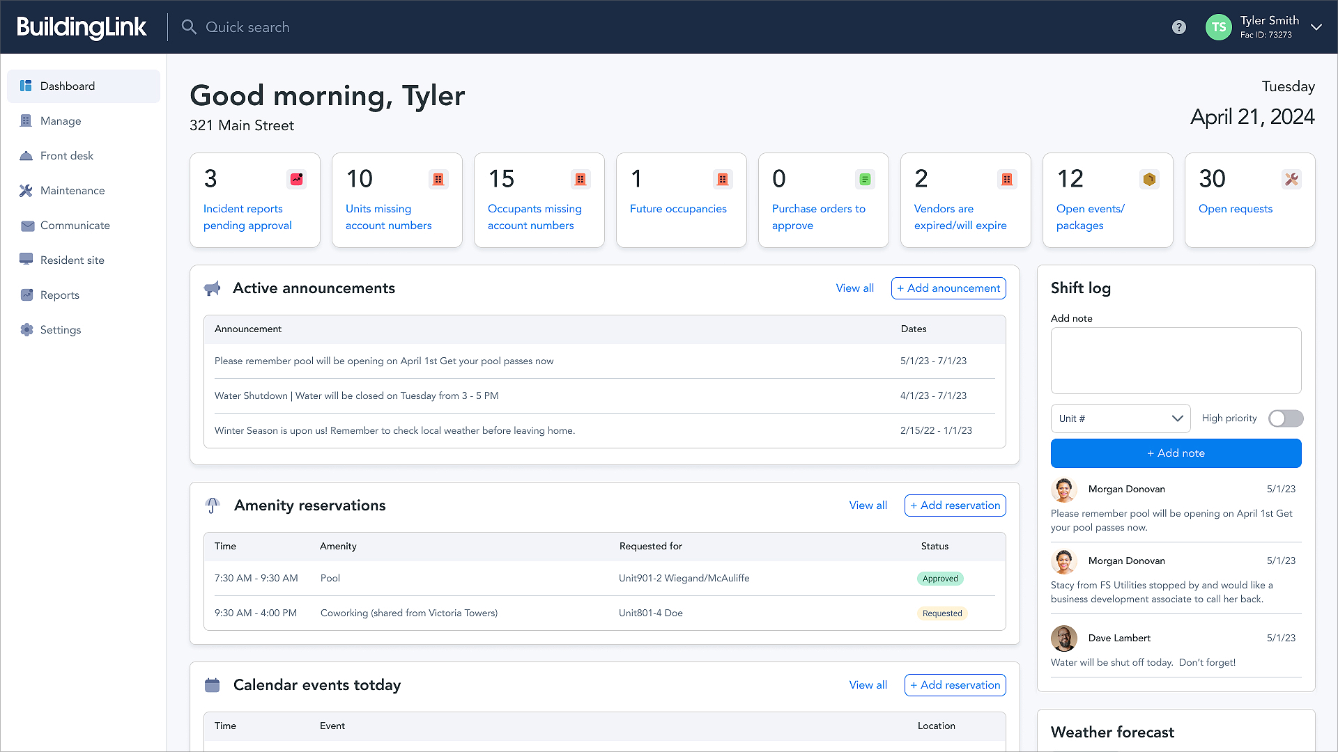
Before and after of the BuildingLink dashboard
Problem
Clutter & no customization
The existing dashboard was cluttered, lacked customization options, and failed to provide meaningful value to users.
Solution
A smarter dashboard
I introduced a new customizable dashboard that offers a high-level overview of operations while enabling users to navigate quickly and efficiently. This enhancement aligns with our mission to empower and ignite our users.
Problem
Disorganized views & complex filtering
List and grid views were disorganized, and filtering was inconsistent and overly complex. Users struggled to locate filters, and key elements varied across pages.
Solution
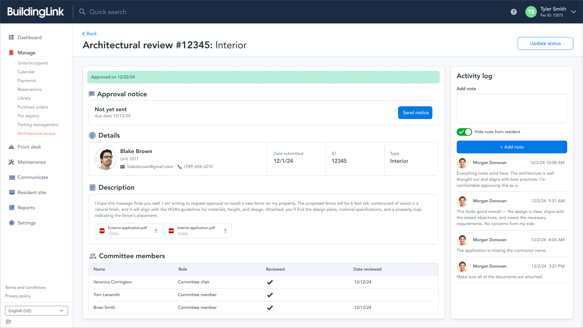
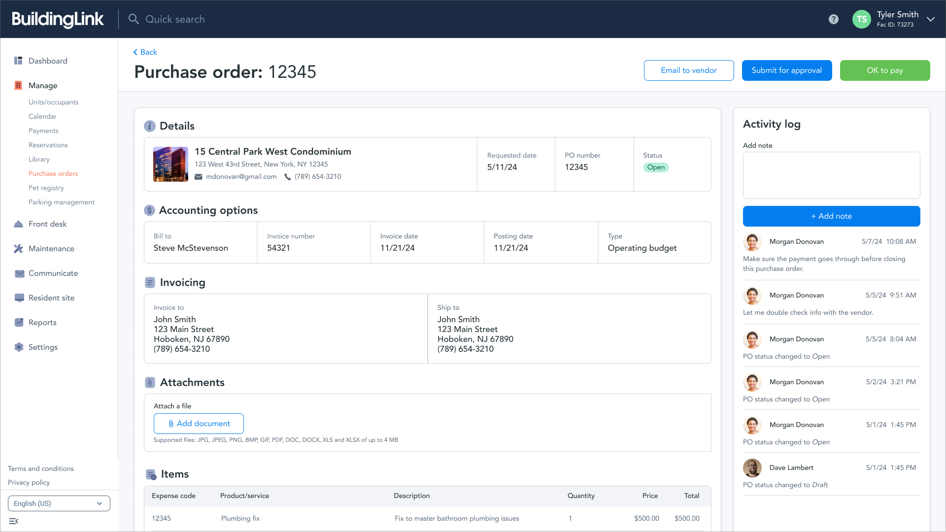
Simplified, consistent, & insightful
I simplified filtering, removed unused options, and ensured consistency. High-level metrics were added to provide managers with quick, valuable insights.
Problem
Inconsistent & complex patterns
Inconsistent and poorly designed patterns made tasks unnecessarily challenging and time-consuming. The lack of uniformity and hierarchy across pages led to user confusion and frustration.
Solution
A unified experience
The new, streamlined patterns created a cohesive experience, enabling users to complete complex tasks quickly and effortlessly.
Key takeaways & measurements
30%
Percentage decrease in support hours
44%
Percentage increase in user interaction
96.5%
Yearly retention rate
$4.2m
Recurring revenue, meeting business goals